Tuesday, 29 March 2011
Tuesday, 8 March 2011
Magazine double page spread 2 G
This is the second plan of my double page spread. This is the plan i am going to base my interview on as it is clearer and easier for the audience to follow.
Monday, 7 March 2011
This is the plan for my double page spread. I plan to write my article into the blue section, leaving room for images ( in purple) so the audience can get a view into the bands life. The images i plan to use will be of the band having fun with the odd studio one as they are a fun loving group and arent ones to pose and be serious. The yellow sections are where i am going to place the quotes taken from the article.
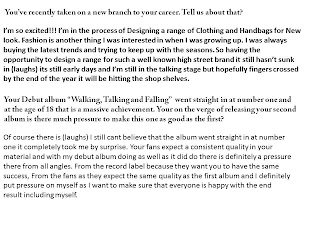
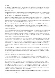
First Interview draft G
This is the first draft of my interview for my double page spread. On my double page spread i am planning to use Quote boxes to pull out little bits that will draw the audience in.
Article draft C
This is the rough draft of my article which may need a bit of adapting but i am fairly happy with it at the moment. The sections that are in red are the parts in which i am going to use in a quote box to catch the eye of the readers and make them want to read more.
Friday, 4 March 2011
Magazine Name and font C S G
On the first and fifth slide we have chosen different font for our main title and fonts for the articles. Our final decision has a star by it. This we will use as part of our housestyle so each of our front covers and articles will be roughly the same so it is easily recognisable by the viewer as a new issue from that magazine. On each of our issues we plan to use the titles in slide 4. This way our title will be different colours so we can then use different colours for each of the issues but still the same font, style and positioned in the same place on the page.
Subscribe to:
Comments (Atom)


