Thursday, 7 April 2011
Monday, 4 April 2011
Tuesday, 29 March 2011
Tuesday, 8 March 2011
Magazine double page spread 2 G
This is the second plan of my double page spread. This is the plan i am going to base my interview on as it is clearer and easier for the audience to follow.
Monday, 7 March 2011
This is the plan for my double page spread. I plan to write my article into the blue section, leaving room for images ( in purple) so the audience can get a view into the bands life. The images i plan to use will be of the band having fun with the odd studio one as they are a fun loving group and arent ones to pose and be serious. The yellow sections are where i am going to place the quotes taken from the article.
First Interview draft G
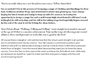
This is the first draft of my interview for my double page spread. On my double page spread i am planning to use Quote boxes to pull out little bits that will draw the audience in.
Article draft C
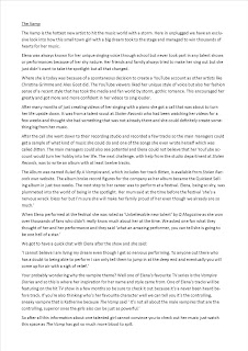
This is the rough draft of my article which may need a bit of adapting but i am fairly happy with it at the moment. The sections that are in red are the parts in which i am going to use in a quote box to catch the eye of the readers and make them want to read more.
Friday, 4 March 2011
Magazine Name and font C S G
On the first and fifth slide we have chosen different font for our main title and fonts for the articles. Our final decision has a star by it. This we will use as part of our housestyle so each of our front covers and articles will be roughly the same so it is easily recognisable by the viewer as a new issue from that magazine. On each of our issues we plan to use the titles in slide 4. This way our title will be different colours so we can then use different colours for each of the issues but still the same font, style and positioned in the same place on the page.
Tuesday, 15 February 2011
Tuesday, 8 February 2011
Preliminary task C
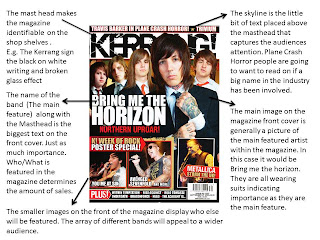
In my preliminary task I think that this layout of the front page is very basic and my actual front page in which I am to design will be an improvement to this. I am going to take the title positioning and keep it where it is possibly moving it down a little so I can fit in a skyline as it is good publicity. The main image will not be spread across the middle section of the page in one block, I will either make it into the background or have a suingular image to one side. I will still include small sections in which has additional information as this promotes what is included in the rest of the magazine. I will also include smaller images too.
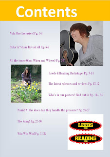
With the contents page I think that I am going to stick to this layout as I like the idea of having images from within the magazine in bubble shapes as it is unusual and attractive. The actual text will then be in a column but not in the scroll style it is at the moment.
Monday, 31 January 2011
Mood Board S
I have chosen the sub genre pop/rock to focus my magazine on. I have chosen a darker side but still has a strong feminine image. The images i have chosen reflect what the audience to that style of band may wear and also the different pieces of location and style a band in that genre may choose to promote their image with. The style mostly focuses on a sense of gothic romance and a lot of reds and blacks are used. the guitar and microphone shows the main instruments a band with that style of genre may use.
Mood Board C
I have chosen to focus my magazine on the sub genre indie punk I can tell from the pictures that i have used that in the spare time playing music skating and bmxing are key activities. The style of skinny jeans, hats, carrying skateboards and converse are what makes the sub genre identifiable.
Thursday, 27 January 2011
Mood Board G
I have chosen the sub-genre Emo from Indie to base my magazine on the pictures in the mood board I have created best represent the sub genre.
From this I have learnt that my demographic audience prefer the heavier sound of the Indie genre for example My Chemical Romance and My Passion.
The colour scheme on the images is generally quite dark indicating that the genre is dark gives a sense of suclusion, depression and mystery.
Their physical image seems to play a major part in their lives for example in the two self images featured on the mood board hair colour, make-up even on the male seem to be dramtic as how they come across as people in society also means alot to them
Wednesday, 19 January 2011
Our Target Audience
The Genre of our magazine will vary with the seasons. There will be 3 additions
Summer
Autumn
Winter
The age of our targeted audience will be teen to young adults with no specific Gender preference
The primary interest of our audience will have to be Music – Latest music news, Latest tour dates and Gig reviews
There other interests may differ to each person
We will keep our magazine modern as our targeted audience like to keep up with the latest releases in both music and technology as music means a lot to them because they are surrounded and listen to it all of the time.
Our targeted audience find out about music through a number of ways- Internet, Music Magazines (In which we intend to create) Mobile Apps, Social Networking etc.
By Sammy Charlotte and Grace
Introduction
In our Media AS Foundation Production we aim to create a music magazine. We have decided to create a magazine in which will have three different additions. The certain genre will be Indie and each addition of the magazine will focus on a specific sub-genre of Indie.
E.g. one of the issues will focus purely on Indie Skate
We have decided to focus our magazine on the Indie Genre as it covers such a wide range of material and has something that will appeal to everyone.
Charlotte Sammy and Grace
Subscribe to:
Comments (Atom)


